PROBLEM
The smart home experience feels more like managing systems than living in a home. One app for lights, another for the thermostat, another for cameras — and the “all-in-one” platforms bury simple actions under layers of complexity.
APPROACH
I started from the core actions people repeat every day — turn on a light, change the temperature, check the door — and built the information architecture outward from habit.
OUTCOME
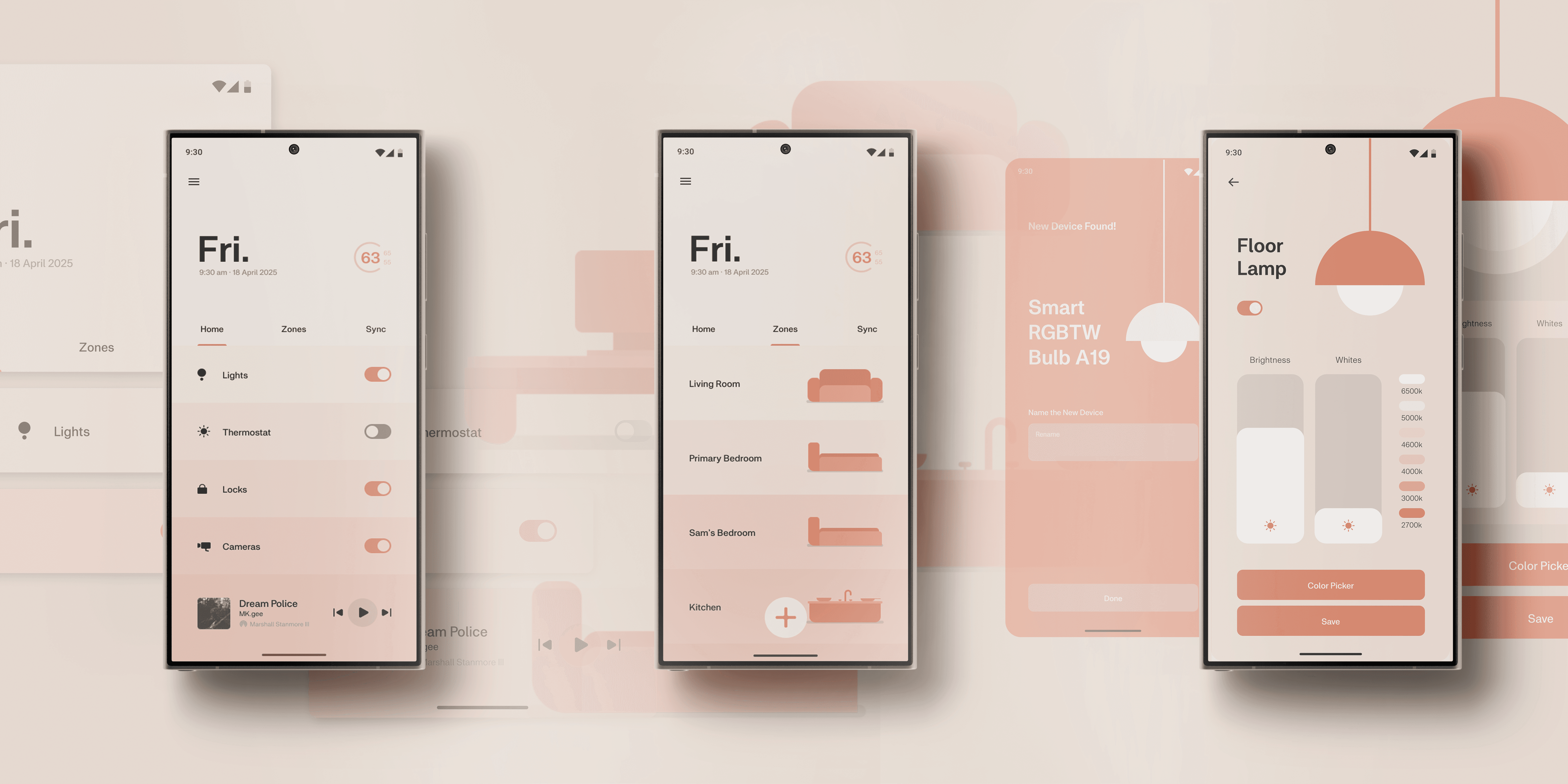
A prototype that pulls the smart home into one clean line: three surfaces (Home, Zones, Sync), a persistent anchor nav, and an interface that makes features vanish into routine.
01 / CONTEXT
02 / PROBLEM
How might we make controlling a home as effortless as living in one?
03 / PROCESS
04 / SOLUTION
Three surfaces, one anchor:


Home
The first screen you land on, the place where everything connects. Lights, climate, locks, cameras — always one tap away from the persistent nav bar.
Zones
Every home is a collection of rooms, and Nuro reflects that. Each space gets its own page: from the whole house down to a single room.
Sync
Smart homes shouldn’t just react, they should anticipate. Sync automates routines, turning everyday habits into things the system handles on its own.
The design speaks softly: calm and precise iconography, layouts that look inevitable rather than styled. It doesn’t brag about features; it makes them vanish into habit.
05 / CRAFT & SYSTEM
Icons stripped to just enough geometry to be instant: a padlock that says "secure" with no ambiguity, a lens reduced to a circle-within-a-circle, room glyphs built entirely from simple forms. Recognition without reading.
06 / REFLECTION
What was validated: anchoring IA to daily habits — not device categories — is what collapses a fragmented ecosystem into one line.
What I'd test next: first-run onboarding and multi-user scenarios (roommates, kids, guests) — where habit-based design gets stress-tested hardest.