
PROBLEM
In-car tech is packed with features that compete for a driver's attention. Navigation, media, controls, and alerts live in separate layers, and every interaction adds friction at 70 mph.
APPROACH
We surveyed local drivers on what actually frustrates them, found one clear signal — navigation matters most — and built the entire system around it. Everything else adapts, appears when needed, and disappears.
OUTCOME
A validated design principle and full interface system: navigation anchored to the environment, alerts surfaced only when relevant, and a customizable dashboard modeled on habits drivers already have.
01 / CONTEXT
Cars ship with the latest tech, but none of it feels unified. Midair is a concept interface system that rethinks the in-car experience as a single responsive layer instead of a stack of competing screens.
A 4-person team project — I drove the majority of the research, information architecture, and interface system work.
02 / PROBLEM
Navigation, media, vehicle controls, and safety systems each live in their own layer, forcing drivers to constantly shift focus between them. Tapping through menus. Scanning dashboards. Reacting to alerts that come too late.
How might we design an interface that stays aligned with where the driver is going — instead of pulling their eyes away from it?
01
Navigation matters most. Drivers picked the nav map first — ahead of speed, battery, and media.
02
Phones are the distraction. Notifications and on-screen clutter topped the list.
03
Simple beats dense. Minimal interfaces and larger touch targets, preferred over more info.
04
Consistency is non-negotiable. Same buttons, icons, layouts across screens.
ONE DESIGN PRINCIPLE CAME OUT OF IT: keep navigation front and center, anchored to the road and environment. Everything else is secondary and adapts around it.


Home
Glanceable overview: essentials prioritized, everything else one tap away.

Map
Navigation integrated with the environment, simplified interface.

Music
Playback simplified to minimize attention shifts.
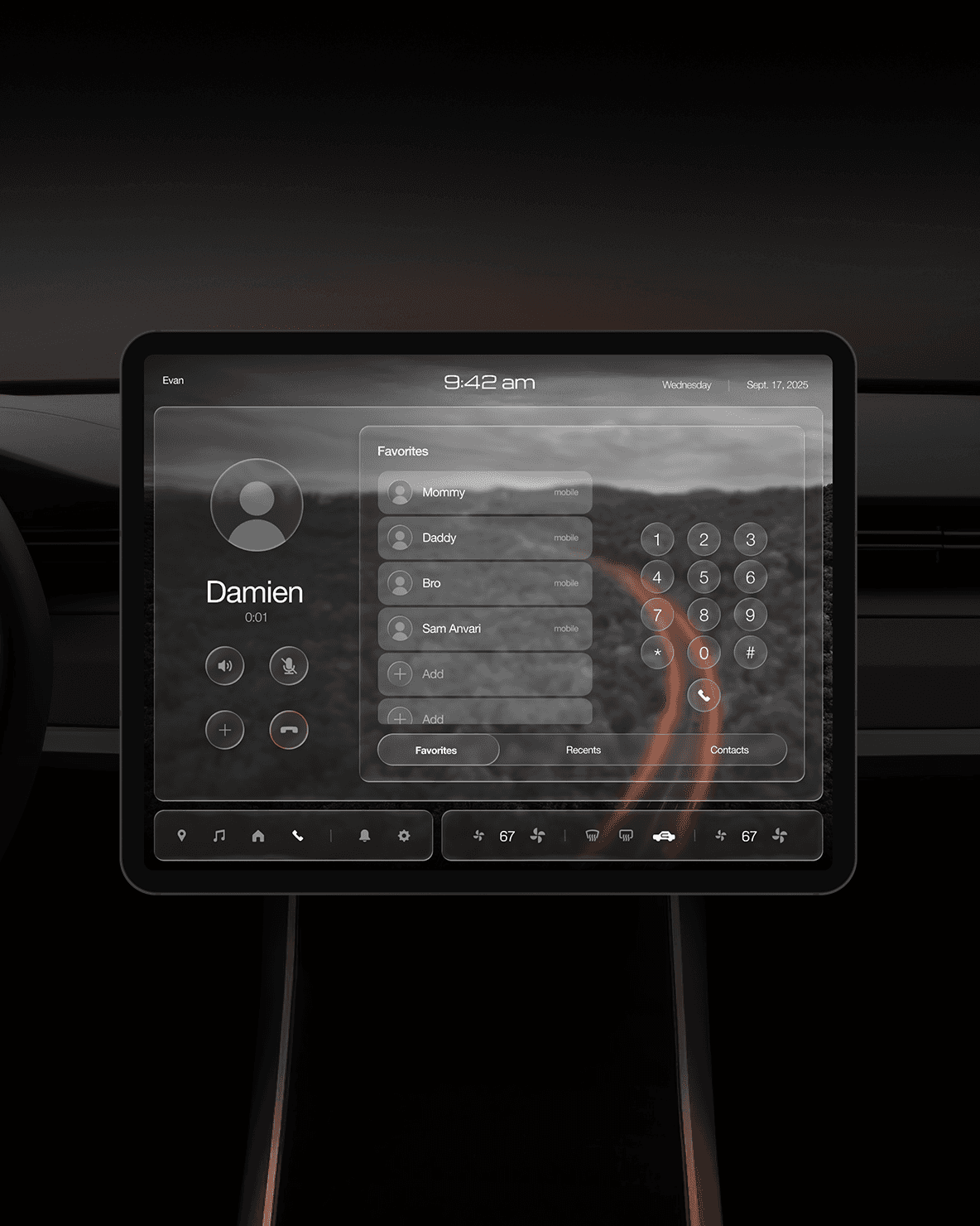
Phone
Calls streamlined with minimal visual noise.
05 / CRAFT & SYSTEM
Iconography built for recognition at a glance: navigation locked to the road, music that shifts in and out without breaking focus, climate controls that surface what matters and stay silent when they don't.
Customization borrowed from a pattern drivers already know: the dashboard works like a mobile home screen.
06 / REFLECTION
What was validated: the research principle held — anchoring navigation and letting everything else adapt removed the layer-switching that drivers named as their top frustration.
What I'd test next: usability testing in a driving simulator — glance time and task completion under real cognitive load.